For this project, we learned about about 11 different types of photographic composition: Framing, Balance, Perspective, Color, Balance, Space, Rule of Thirds, Texture, Depth of Field, Lines, Pattern and Symmetry. We were sent out to take different examples of each type of composition. Then we chose the best example of each different type that we took, and these are the ones that I think best represent each form.
Framing:
Framing:
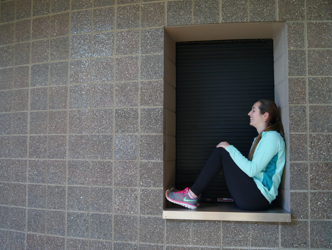
Framing is a tactic used to single out the subject and make it stand out more. You do this by placing the subject in a 'frame', and can add context, depth and a sense of organization to the image. Above, the girl is sitting in a window, framed by the rim of it. This separates her clearly from the wall, and gives the image depth. This also makes the photo seem more than two-dimensional.
Rule of Thirds:
Rule of Thirds:
The Rule of Thirds is one of the most common types of composition. To use it, you have to mentally draw two horizontal and two vertical lines, splitting the image into a "tic-tac-toe" grid. Putting the subject on an intersection of the lines, or on a line, can give the image a more interesting perspective, and give it balance. Studies have shown that when looking at photos, people's eyes are more naturally likely to go to one of the intersection points or lines, so it gives the image a more natural viewing point. In this image, the subject is at the upper left line intersection.
Perspective:
Perspective:
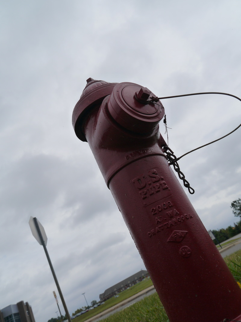
Perspective is a rather simple strategy in photography. This can make the subject look larger, or smaller, depending on the perspective of the shot. If you shoot from a low angle, the subject will look a lot larger than it would at the standard height of shooting. If you shoot from a higher angle, the subject will look smaller. Different images look better with different angles. In this image, the fire hydrant looks a lot larger than it does in person because the angle the photo was taken at is lower.
Depth of Field:
Depth of Field:
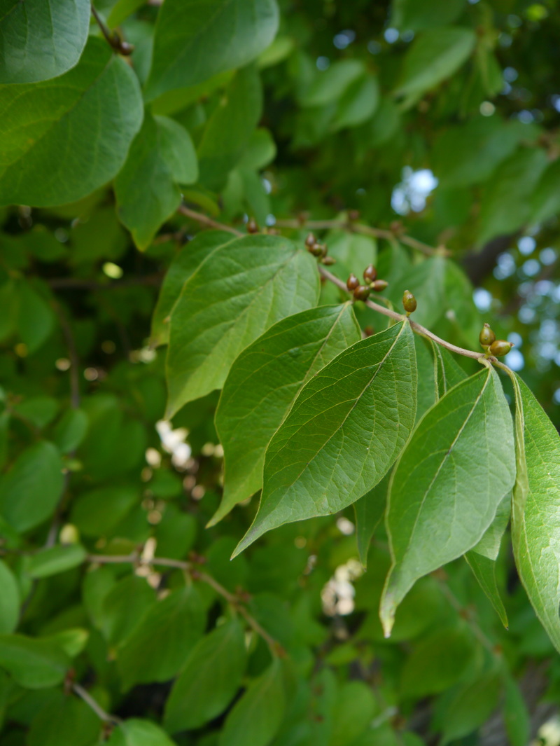
By using Depth of Field, we can highlight our main subject and cancel out distractions in the background. It takes the viewer's focus straight to the subject the photographer wants you to see. In this image, a few leaves are in perfect focus, and the rest of the leaves are blurred out. This makes the viewer notice the front leaves first, before the leaves in the background.
Pattern
Pattern
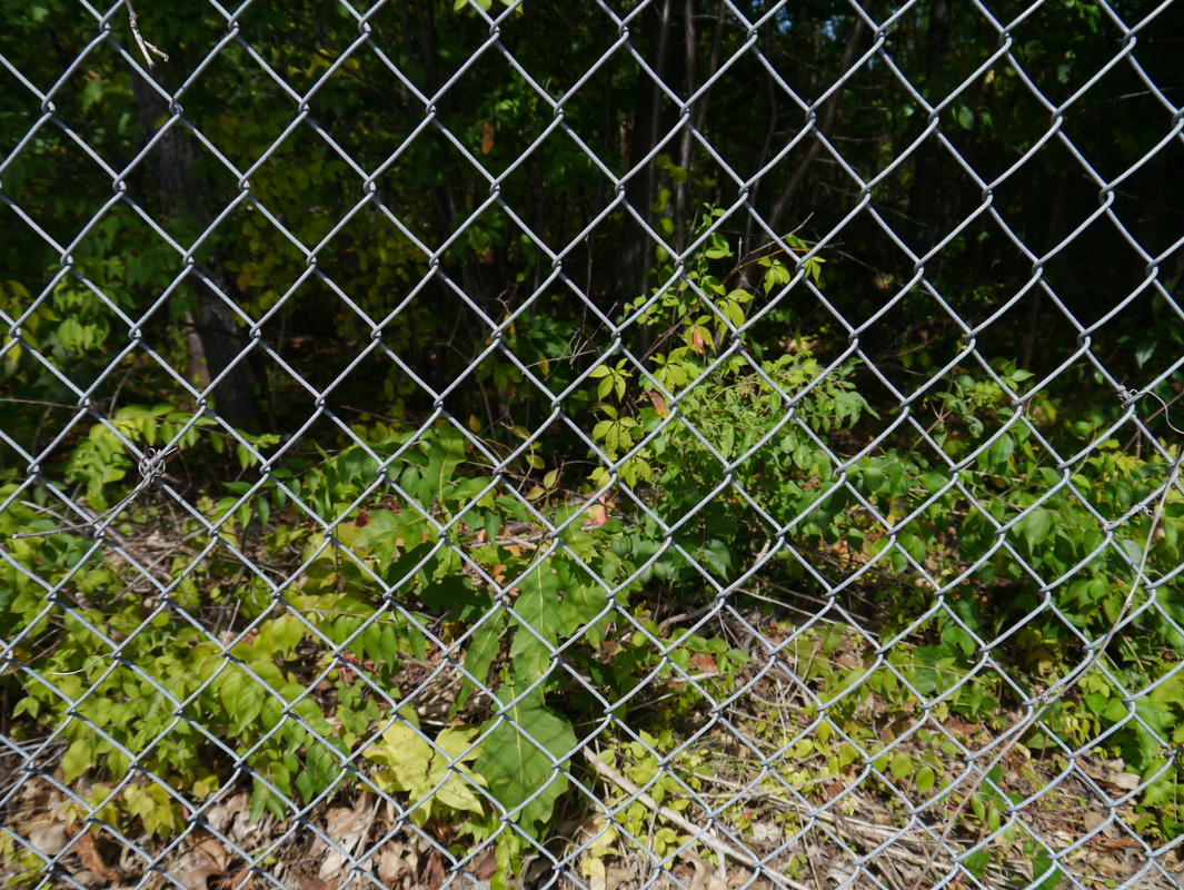
This photo demonstrates pattern because there is a repeated subject across the whole frame of the photo. By emphasizing repetition or pattern, we can give the impression of size and/or large numbers. You could also break the pattern, by placing an odd subject in the middle of the repetitive subjects. In this photo, the wired fence stretches out across the whole frame, and gives the impression that it is repeated for many times onwards.
Symmetry
Symmetry
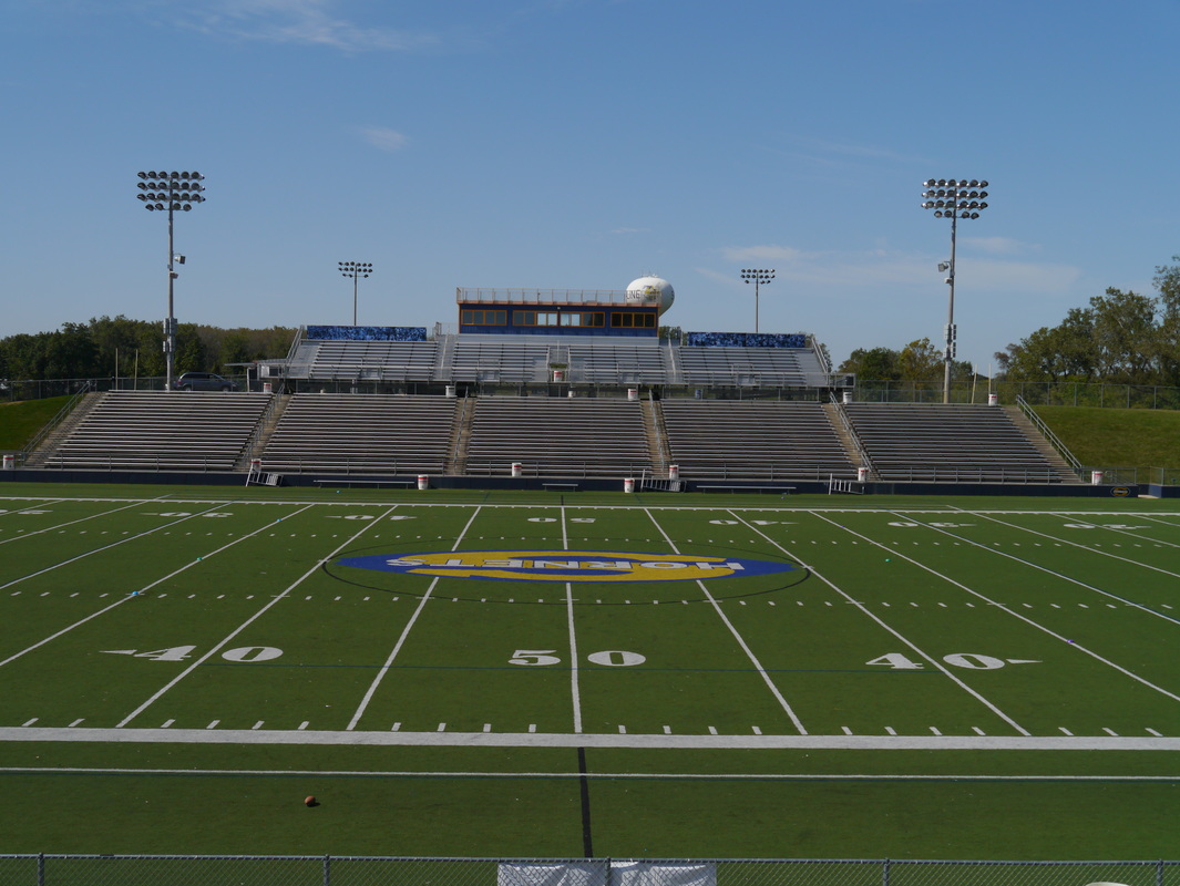
Symmetry is a technique that photographer's use to accentuate natural symmetrical occurrences. In this photo, the football stadium is the same on either side. By taking a photo that is symmetrical on both sides, we can give the image a much stronger feel.
Texture
Texture
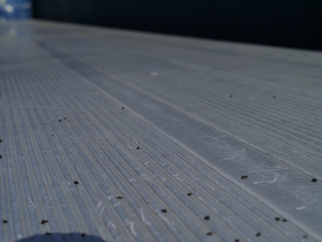
By zooming in close and allowing light, angles and perspective to guide you, textured images can be extremely powerful. In this image, you can clearly see the indents and holes and scratches and lines in the seat on the football stadium. The lighting here accentuated the roughness of the metal, and made for a very interesting shot.
Balance
Balance
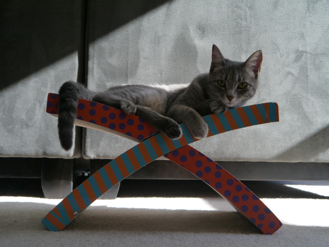
This was one of the more difficult types of composition to utilize in an image. Balance involves having an image that is not too heavy or light on either side, meaning not too many subjects on one side of the image. Another example of a balanced image would be having a moderate and consistent lighting on either side of the photo. The photo above is an example of balance because the subject is in the middle of the frame, and the cat is spread out over both ends of the object. There is dark lighting in both the top left and bottom right corners of the image, and this makes the image balanced.
Color
Color

Photographer's use vibrant, bright colors to portray a message, emotion or theme in an image. Above, I took a photo of an electronic sign outside of my high school. By getting up close to the different pixels that make up the letters, you can see bright colors that are the main highlight of the photo.
Space
Space
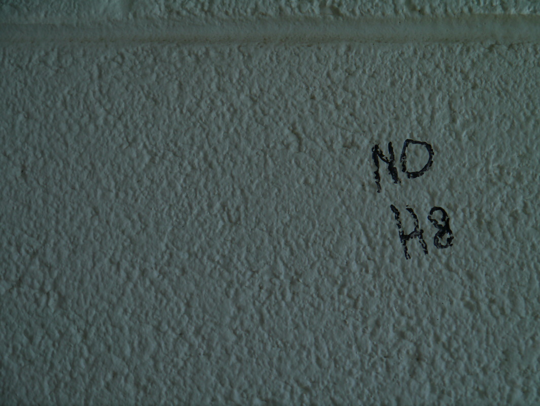
A photo with space is a subject separated with a plain background. In the photo above, you can see "NO H8" pencilled in on the wall. The empty space around emphasizes the significance of the letters. This brings the viewer's eyes straight to the words.
Lines
Lines
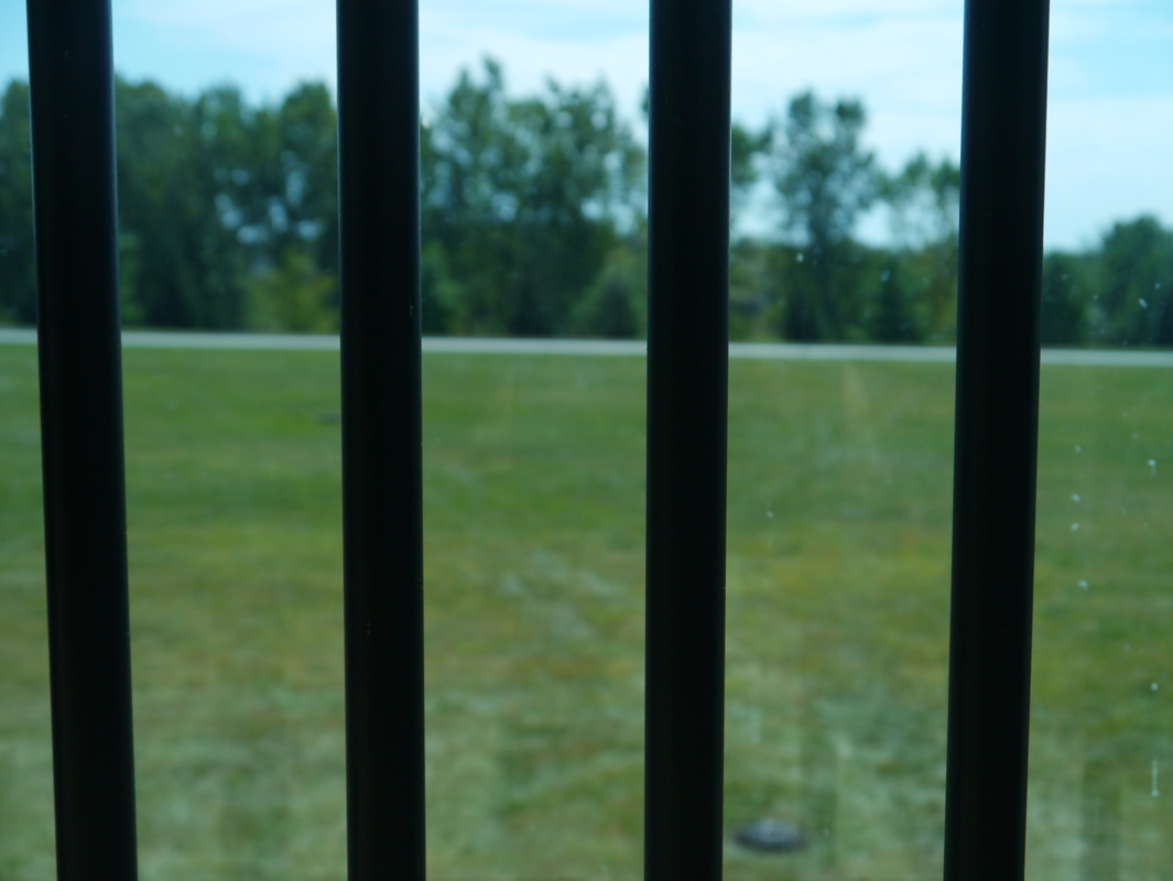
Lines give an image the illusion of being longer or wider than it actually is. The above photo is of four lines on a window, with trees and grass in the background. By taking a photo of lines up closer, it can make the viewer believe that there are many more lines on either side, and also that they are much longer than what's in the frame.
What I Learned
In the Composition Assignment I learned 11 different and unique composition tactics that photographers use to make their photos more interesting, have more depth, and also portray emotion. I think that this was a valuable lesson to learn because now I can use these methods in my everyday photo-taking.
 RSS Feed
